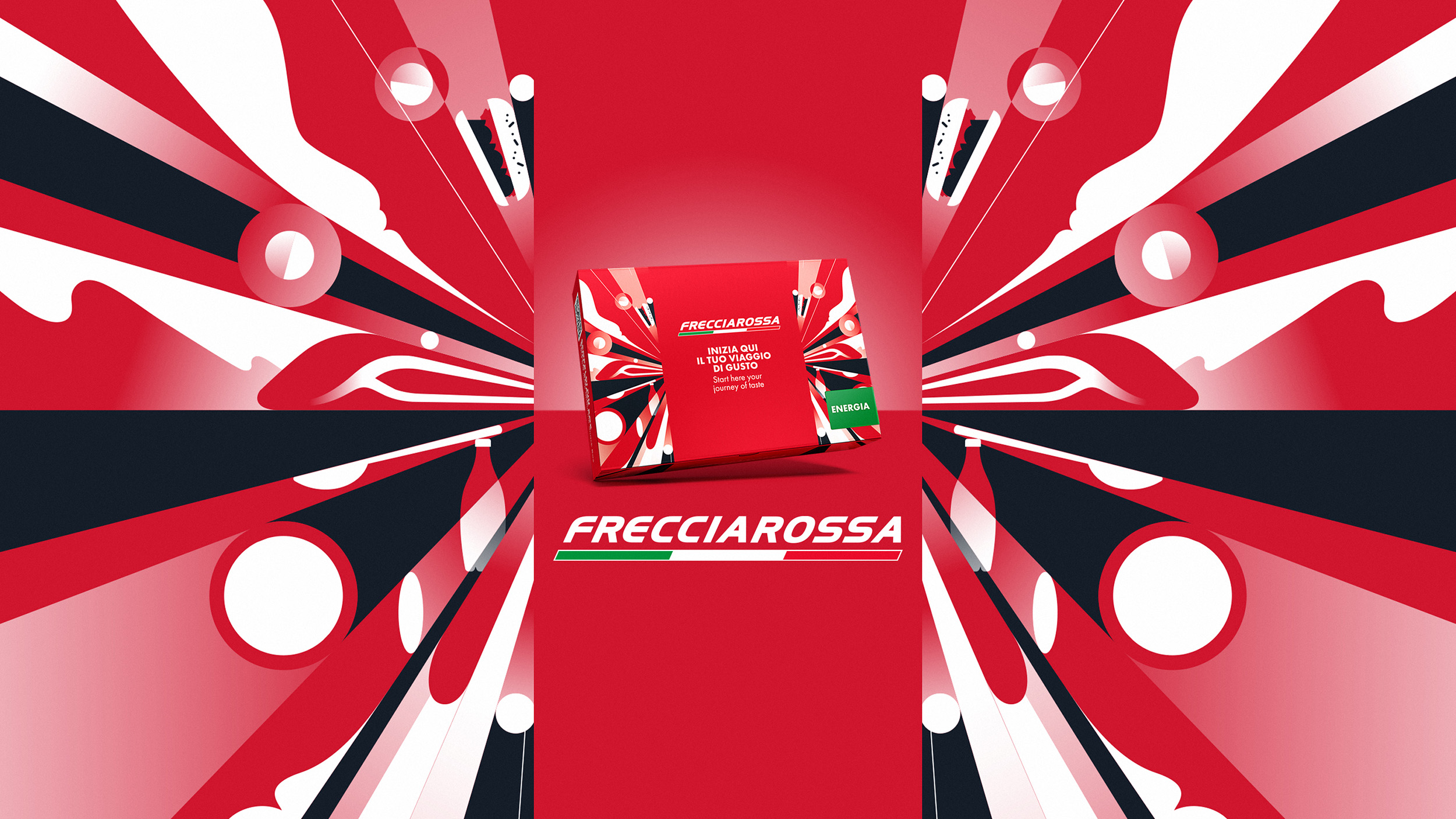
Frecciarossa represents the pinnacle of high-speed rail transportation in Italy. Therefore, when we were entrusted with giving a new look to the snack box served to high-level travelers, our objectives were to express the high quality of selected Italian food and the brand’s contemporary vision and aesthetic design.
The chosen style combines these elements with an abstract graphic stroke that communicates speed and elegance. Red remains the predominant color for the box intended for adults, while the Kids box is characterized by an explosion of colors.
Furthermore, the storytelling of the snack box has been enhanced to provide greater clarity and emotion in the narrative of the food and the origin of the ingredients, along with new analog gaming content for the box aimed at very young travelers.
The naming of the different boxes has also been optimized, metaphorically describing moments of the day and aligning the service with travelers’ expectations.
Finally, the snack box utilizes recycled materials that are meant to be properly recycled again after being collected by the onboard assistants.
The snack box restyling project is part of a process of revisiting the entire visual identity associated with dining - and not only - on Frecciarossa trains, providing the first piece and reference point for the repositioning of the food offering as a whole.


